


Branding Case Study: Bennett. Identity and Website Design for Tea Brand
Branding Case Study: Bennett. Identity and Website Design for Tea Brand Graphic design and web design case study by tubik agency: the identity and e-commerce website creation for Bennett Tea, from early idea to implementation on Webflow.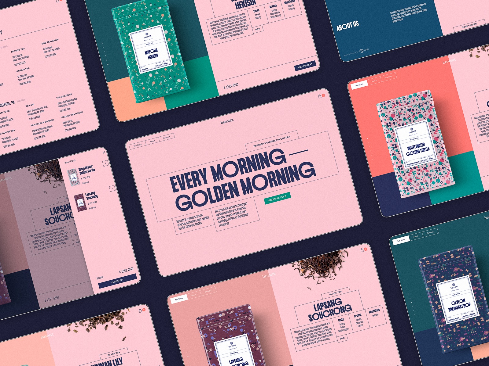
According to Lao Tzu, tea is the elixir of life, so let us offer you a sip of tea elegance packed in design. While most of our case studies tell you the design stories based on business ideas, but this time we will tell you about the business idea originating from the simple creative spark inspired by daily moments. Welcome to check the design story about the identity and e-commerce website creation for Bennett Tea, created by Tubik Agency.
Project
Bennett is a modern brand offering users high-quality tea for different tastes. It produces various worldwide popular beverages, such as black tea, herbal tea, green tea, decaffeinated tea, iced tea, and seasonal tea. The brand is positioned at the crossroads of hot trends and classic traditions and transfers the idea of elite, exclusive products which are about lifestyle and mood rather than just a drink.
Identity Design
The logo design for Bennett is based on the symbol, which presents a combination of shapes sharing the visual metaphors of a teal leaf, an eye, and a teacup seen from above. The sign is harmonically combined with a typographic part that features the brand name presented in an elegant and minimalist manner.
![]()
The brand identity that had to stretch to the e-commerce website design is rooted in the creative spark that is sometimes hidden in the simplest things. It started when our designer and art director, Ernest Asanov, got inspired by a photo of neatly collected tea leaves and started developing the idea. In identity design, it got transformed into a graphic pattern, and later the set of patterns applied to packaging and branded items. In the website design, the idea to feature realistic images of tea leaves turned into a video used on the product page.
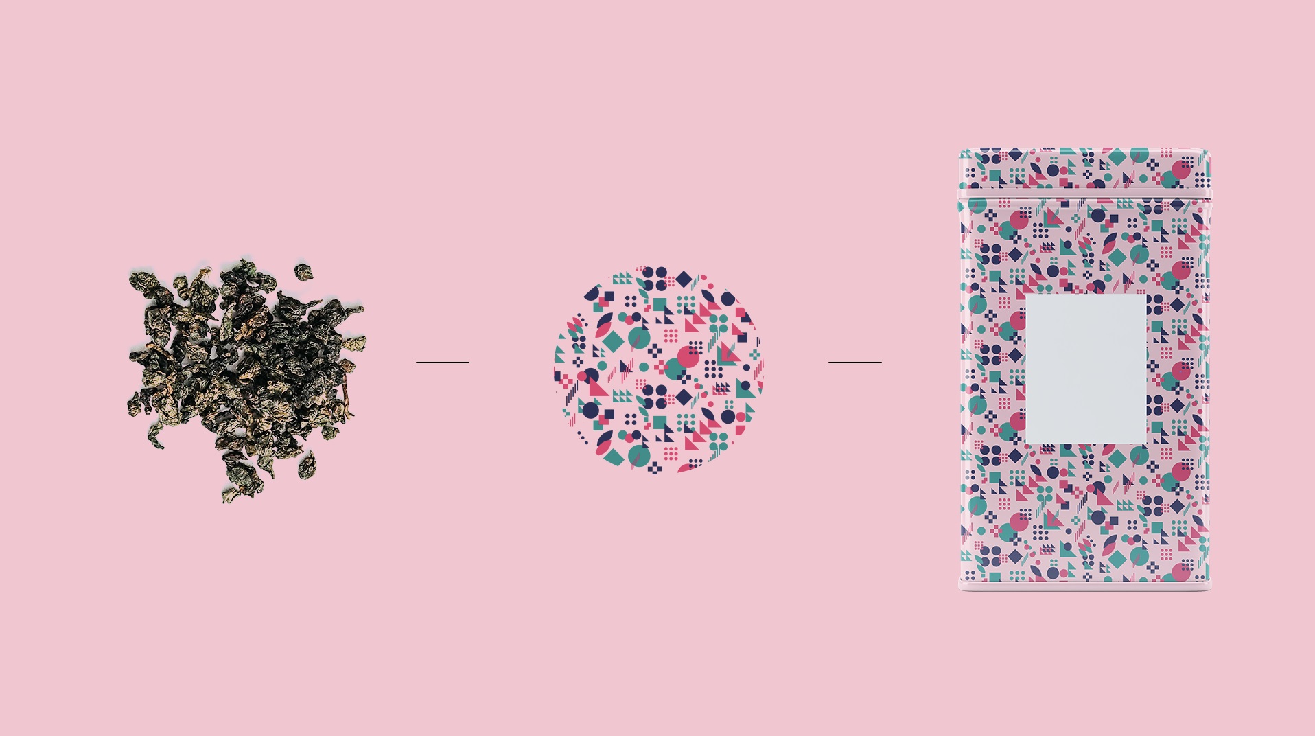
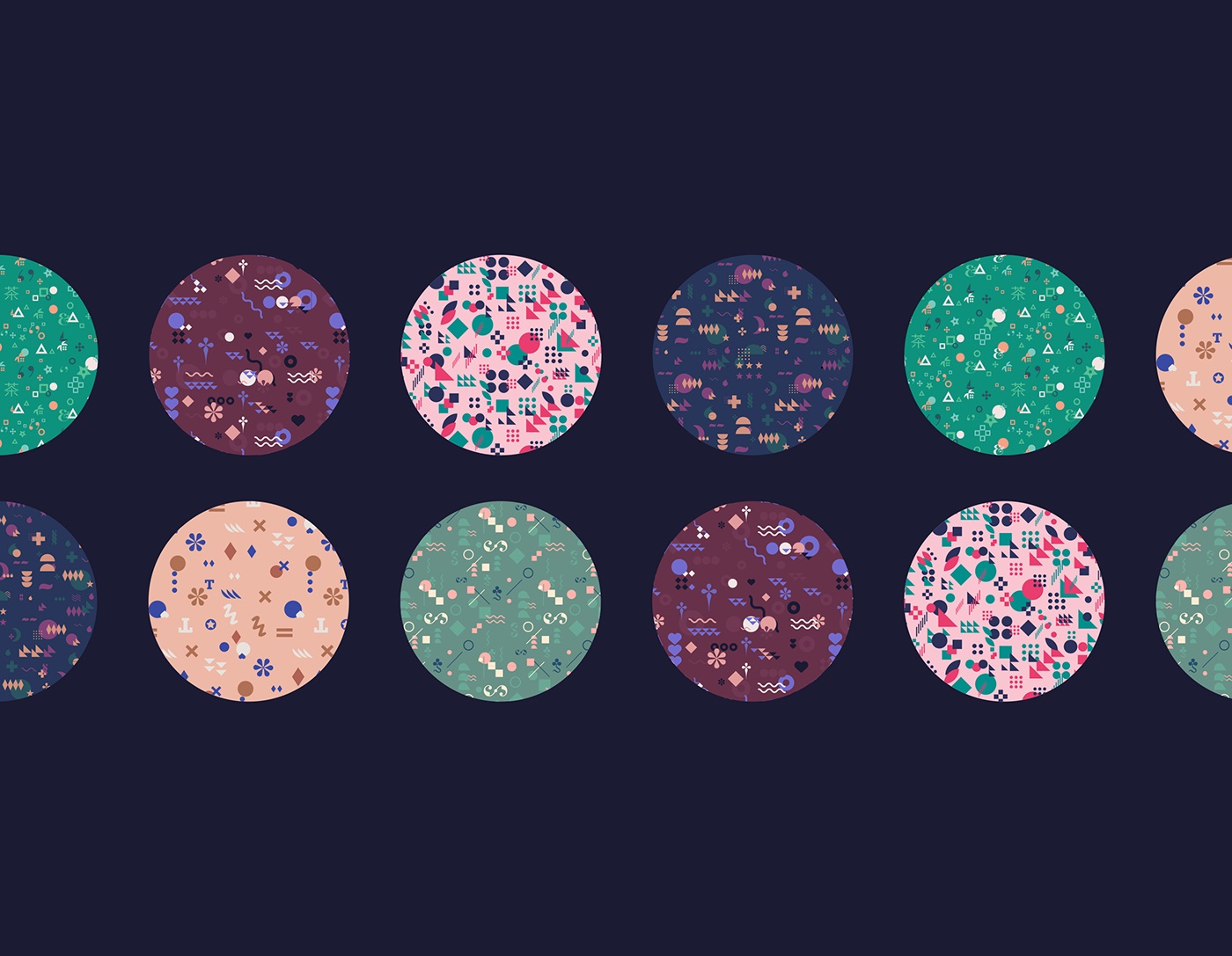
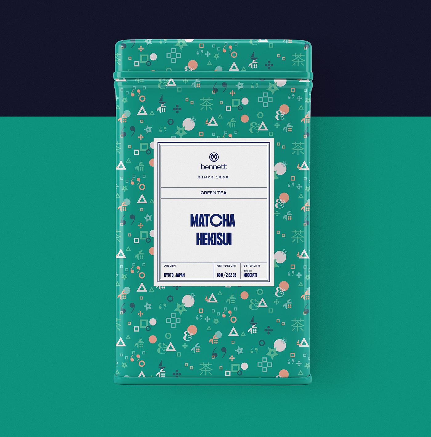
Here’s how the graphic patterns became the basis for packaging design and stylish paper cups.
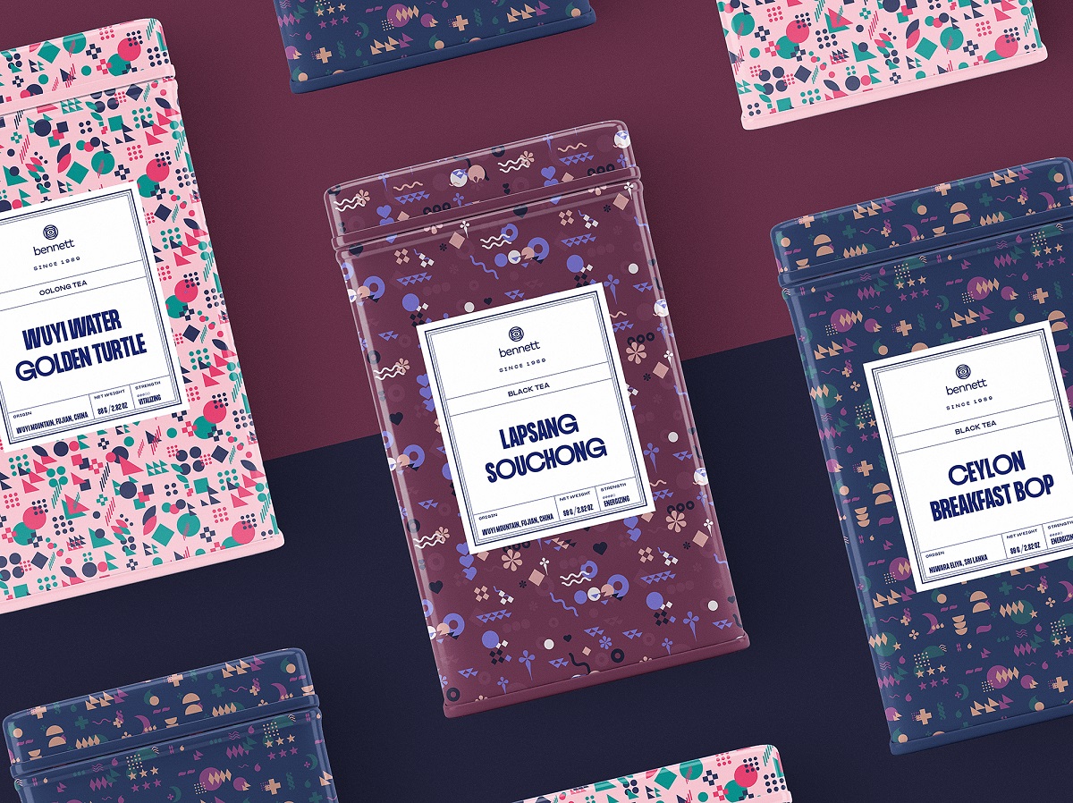

From the packaging perspective, one more important design task was creating an informative label that corresponds with the general stylistic concept and keeps consistency across a variety of packaging options. The label design carefully arranges a lot of text content about the particular tea blend to make it readable and straightforward; it looks original and trendy due to typeface choice and enhances perception with neat and clear line icons. The front label contains only key information and focuses buyers’ attention on it without distracting or overloading them with too many details, while the back label presents much more detail.

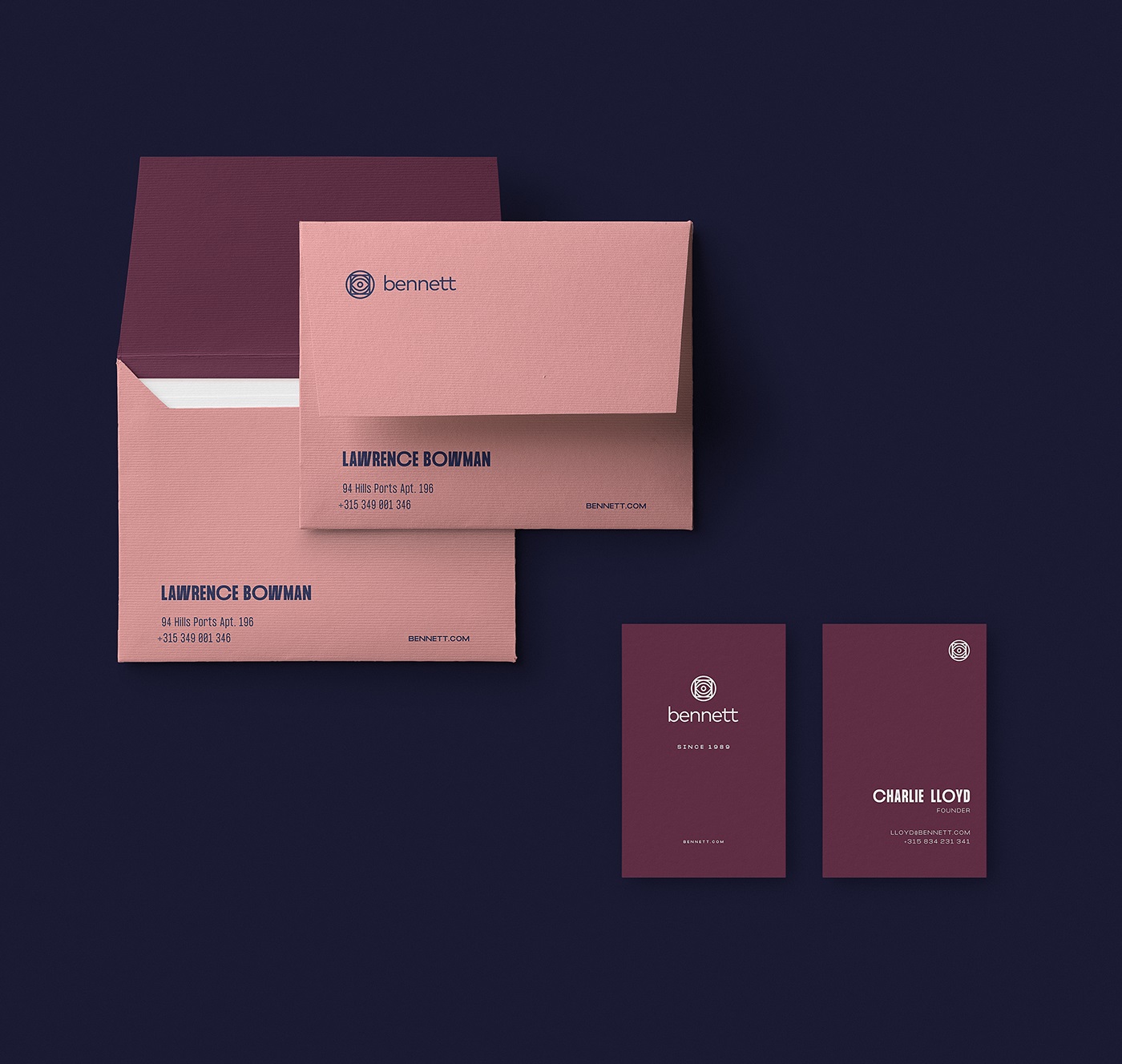
As a part of identity design and brand communication, special branded envelopes and business cards were also developed to echo the style.
Web Design
The website design approach starts from the home page, which uses typography as its primary and only tool for informing and impressing visitors. No photos, no illustrations, only the elegantly wrapped text content setting the mood and call-to-action button seen at once and inviting the visitor to check the range of the offered products. Product pages instantly connect to the tea theme and set the emotional and aesthetic appeal due to the video of tea leaves scattered from the top of the screen.
Here’s a closer look at the interaction with product pages in the tea store. The layout is built on bright and bold color combinations for the backgrounds, effectively highlighting various products in different packaging colors. Split screen, sophisticated geometry, smooth animation, and original typography – that’s what the designer chose for this case of web layout. The text information is organized in boxes, forming a sort of asymmetric grid.
To keep up with the external consistency and recognizable mental patterns of commerce website users, the website uses a stylish and minimalist sticky header, with the brand element in the center, links to core navigation in the left part, and a shopping bag button in the right corner. The latter uses the visual marker accented by color to let visitors quickly see if they already have something in their shopping bag.
The live Bennett Tea website was fully implemented on Webflow: for our team, it was a great chance to try how it works for non-standard design aimed at e-commerce objectives.
To make the website look good and work effectively on various devices, the designers worked out the mobile version of the website.

The website got positive feedback from the global design community, having received three awards on Awwwards: Site of the Day, Mobile Excellence, and Developer Award, proving once again that Webflow allows for the effective implementation of projects of different complexity and non-standard design solutions.
Stay tuned; new case studies are coming soon!
More Design Case Studies
Here’s a set of more case studies sharing the design solutions and approaches for some of the design projects done by the Tubik team.
Glup. Delivery App Branding and UX Design
THT. Website Design for Electrical Engineering Service
Komuso. Website Design for Wellness Tool
PointZero25. Identity and Website Design for Event Agency
Nonconventional Show. Website Design for Podcast
uMake. Branding and Website for 3D Design Tool
BEGG. Brand Packaging and Web Design for Food Product Ecommerce
Crezco. Brand Identity and UI/UX Design for Fintech Service
FarmSense. Identity and Web Design for Agricultural Technology
Carricare. Identity and UX Design for Safe Delivery Service
OOP. Brand Identity Design for Online Flea Market
Otozen. Mobile App Design for Safe Driving
Originally written for Tubik Blog, graphic and video content by tubik
- English
- Ukrainian